How to Choose Paint Colors
One reason why it’s so stimulating to go out into the world is the experience of different textures, sounds, smells, and most of all, colors. But why is it such a challenge to choose a paint color for our home?
That’s because we have a visceral reaction to certain colors and tones in our world. Right now out my window I’m noticing the yellow Orioles perched on my back fence…the vivid greens in the golf course grass beyond….the turquoise blue of the Pacific Ocean in the distance.
And from working with my interior design clients I know this: every person has a different reaction to color.
Most of my clients who are 50+ Baby Boomers (and frankly, just about everyone I’ve encountered) are intimidated by the color choices that abound for their walls. Here are some professional designer tips to make it easier to choose.

Brush on a beautiful color!
The world of paint has changed drastically over the years. Companies like Benjamin Moore, Behr (Home Depot’s brand) and Sherwin-Williams have produced wonderful products that go on in a single coat, with a depth of color never before achieved. A primer coat is often built into these products.
To make things even easier, paint stores can mix your chosen color for you and provide it to you curbside for easy pick-up in this time of social-distancing.
The color trends I’m seeing now are reaching into the deeper, jewel-toned colors for kitchens, ivories and neutrals for minimalist spaces, and vivid turquoise and cobalt blues in fabrics, window coverings and patio furnishings.
Ready to choose a color? Try one of these tricks:
Observe colors in fashion. Look at the colors of fashion now. The color trends that pervade our world begin with fashion and cars of the moment. These trends trickle down into furniture, accessories, and yes, paint. There is a world of color to experience! Tip: if you enjoy wearing a certain color, chances are good that you’ll enjoy it on your walls.

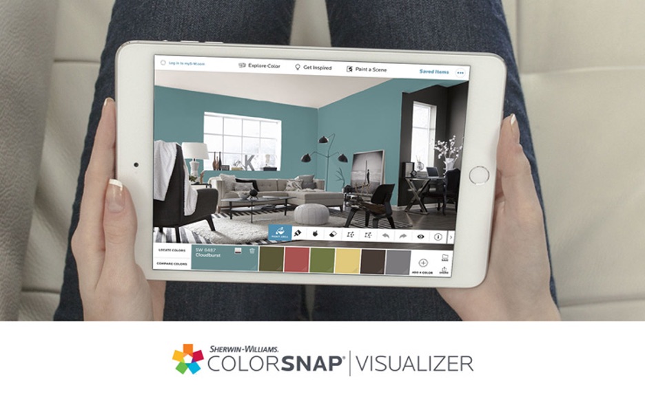
Choose a color and view it in your room. Here’s what I ask my clients: do you have a favorite outfit, scarf or accessory in your home in a color you absolutely love? Start with that. Match it to a paint chip using one of the wonderful apps out in cyberspace (Benjamin Moore and Sherwin-Williams both have great apps).
Once you’ve selected your color, take a snapshot of the item or wall you want to paint and upload it to the app. Now you have a good idea of what your selected color will look like in real life.
Start small. If your chosen color is a vivid one, use it sparingly at first, if you like. Paint a piece of furniture, a fireplace mantel, the shelves and back of a bookcase, a table top, or a closet door. Or use it to paint the moldings around a window or door.

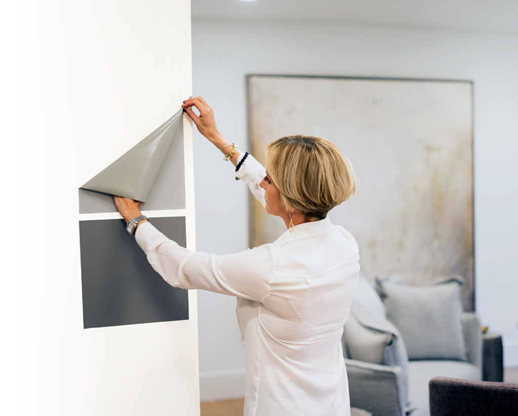
Preview your wall color. Ready to paint a room? One great online service I’ve discovered are peel-and-stick paint samples made with real paint! Https://sampliz.com. Their quick, pre-painted sample sheets of paint colors will easily adhere to your walls for a color preview you won’t get with a tiny paint chip.

Their handy paint samples are offered in Sherwin Williams, Home Depot, and Benjamin Moore paint lines. Use these samples to gauge the impact of your color on different walls of your room. The peel-and-stick samples can be repositioned multiple times without damaging your walls. Genius!
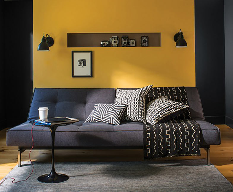
Paint for effect. Choose one wall to make an impact. Or a wall above a chair rail. One clever technique that’s very effective is to paint all of the baseboards, moldings and ceiling beams in your room in a color that really contrasts with the walls. Think white walls and black trim, or deep green, taupe, or navy blue. Talk about style!

Ready to get started? Have fun and remember, it’s only paint. But what a dramatic change you can make with a few strokes of your brush!
I’d love to hear from you! Send your comments, and your before and after photos, to me at marleneoliphant@gmail.com.
Leave a Reply Cancel reply
Follow Along:
Honors:
Privacy Policy | Copyright Marlene Oliphant Design 2020
marleneoliphant@gmail.com


